Ongoing Project
Metal Icons
Icons from the Metal collection.
Over the years, I have tried all sorts of icon families and sets available online, but I consistently face the same issue: it's challenging, if not impossible, to find a comprehensive icon set that meets all my project requirements.
Sometimes you come across a fantastic icon set, only to discover that it's lacking a few essential illustrations. I've also had situations where I require an outlined version of a set or a different size. In all these situations it was another designer or design team applying rules and requirements taken from their project, their product or company brand.
I believe that for a product to appear unique and mature while maintaining a cohesive feel, it is important to have its own custom iconography. So, I've set out to start building my own icon set—one that I can independently grow and utilize on projects I'm currently working on, and also rely on when I need to move quickly on an idea.
The Design System
To ensure that my icons feel consistent and follow a unified style, I have drafted a set of rules and guidelines. These attributes serve as a foundation for designing the entire set. The rules cover various aspects including type, size, spacing, shapes, strokes, and corner radii.
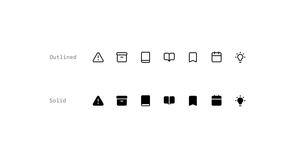
Type and Stroke
Metal (for now) has two main variations: filled and outlined. The stroke width for the outlined variant is set to 1.5px for lighter appearance and a weight similar to 16px text.
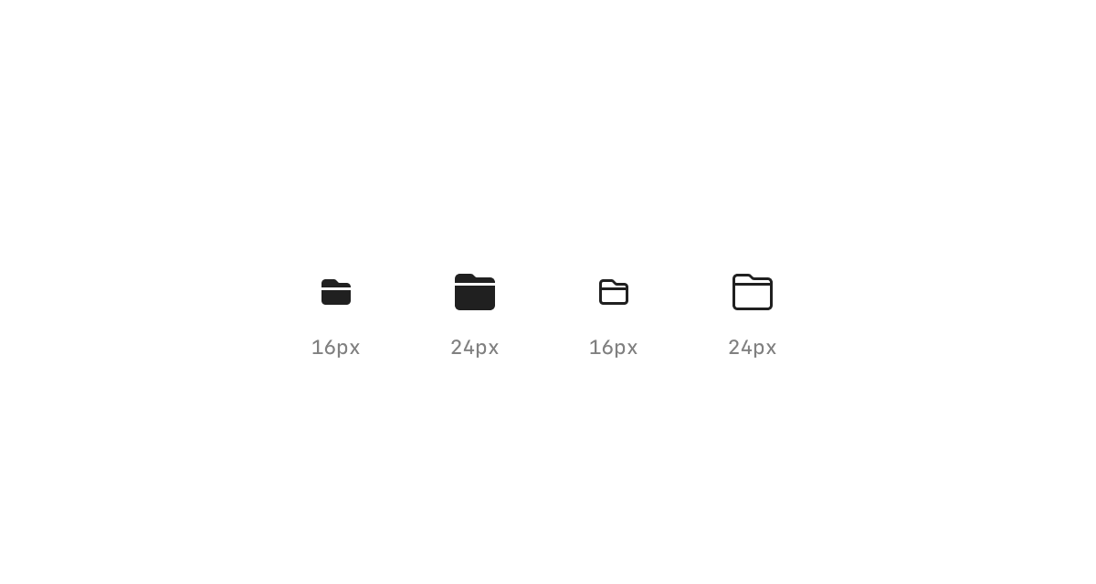
Grid Size
Each icon has two sizes: large 24px and small 16px. These sizes enable the use of icons in various scenarios or components, such as buttons or avatars.
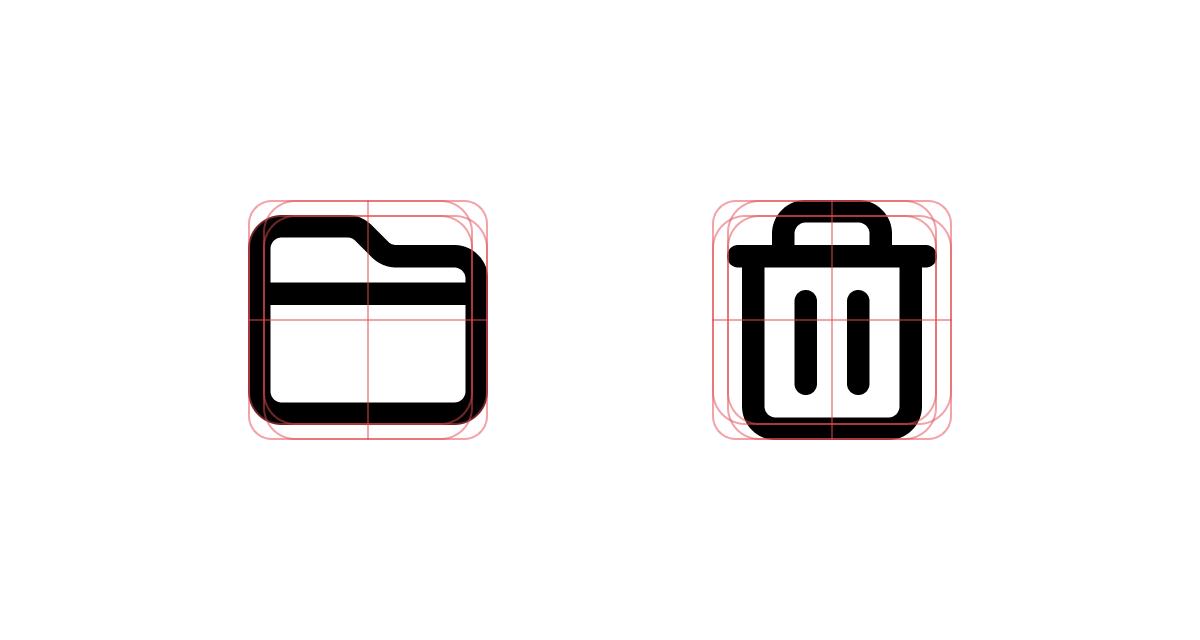
Icon Keylines
My keyline templates keep me honest. They represent the set's rules visually, allowing me to design an icon quickly and keep it consistent with the rest of the set.
Component Library
While designing and growing this icon collection, I have also been building the component library for React. That way, any developer using React can utilize this set.
My goal with this project is not only to fulfill the need for a comprehensive icon collection that I have full control over but also to expand this process into a larger UI project in the future 🤘.
MetalIcons.com
I have launched a new site for the project, and you can track its progress on GitHub. There, I have stored all 150 icons in both outline and solid variations there. You can also find a Figma community file with all icons as components, ready to be used in your next Figma project.